A rural bank is judged on whether it looks like it will still be there next year.
Ankobra West Rural Bank serves the Western Region from Esiama — farmers, traders, small businesses. Its customers meet the brand on a passbook, at a counter and on a branch wall long before they meet it on a phone, and in that setting an identity is not decoration. It is evidence that an institution is solid.
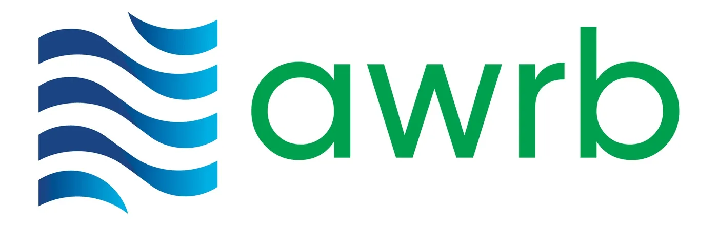
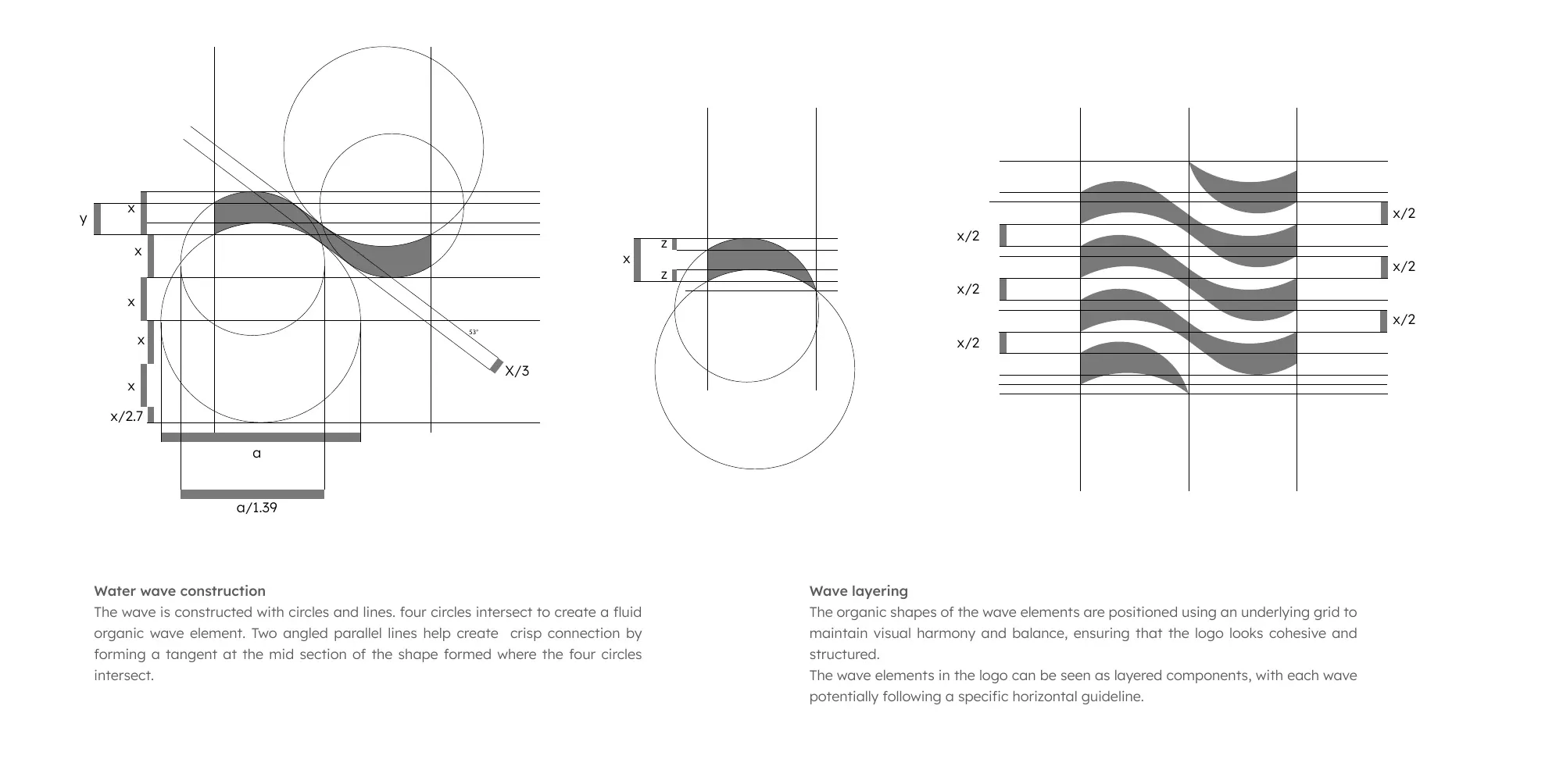
The bank is named after the Ankobra River, a working waterway that carries the local economy. That was the whole idea, sitting there unused: the mark is the river. Four layered waves, constructed on a grid of intersecting circles and angled parallels so the fluidity is drawn rather than sketched.
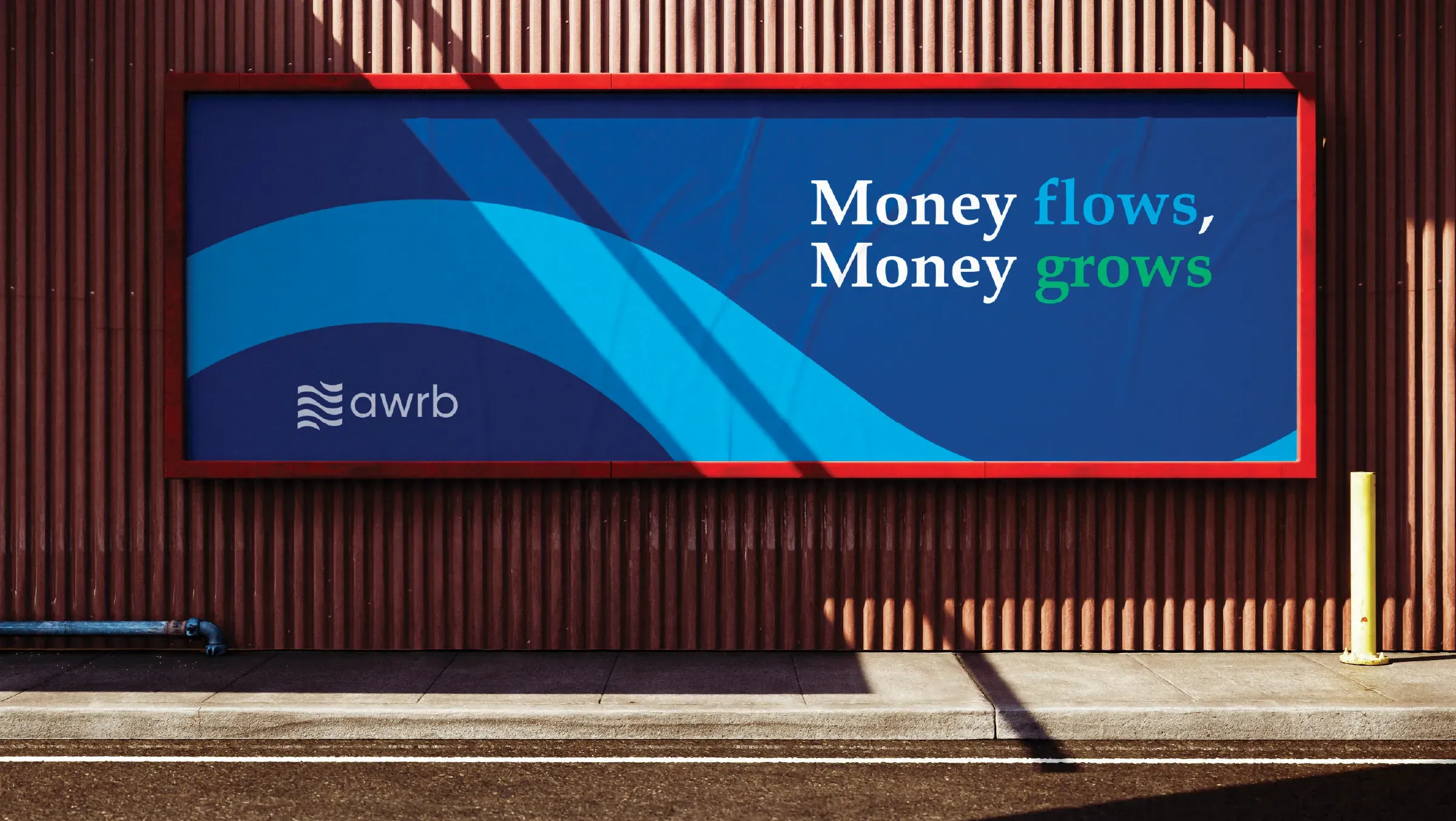
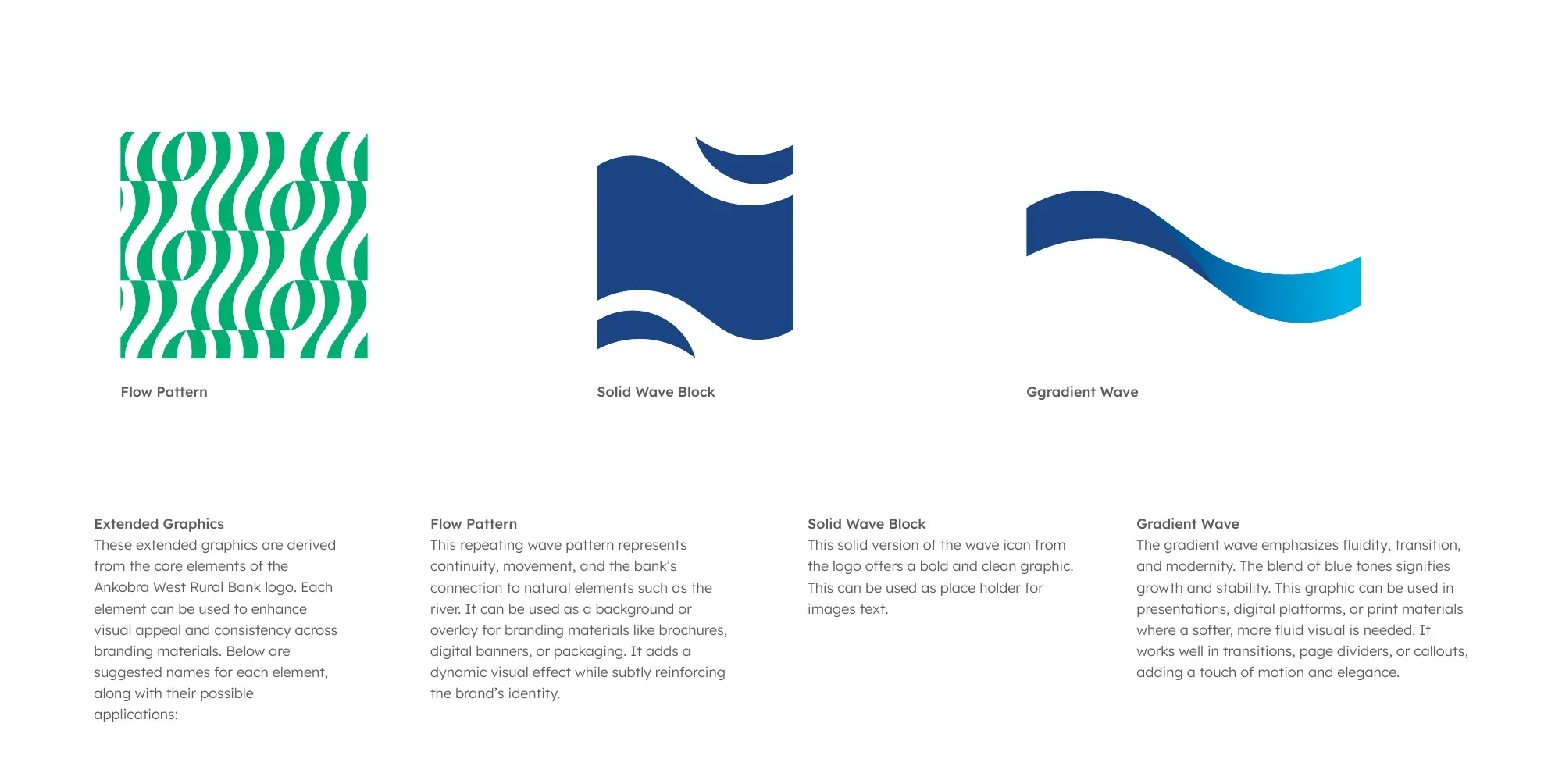
It gave the system something most bank identities lack — a graphic element that can grow. The waves become a repeating pattern, a solid block, a gradient ribbon; they run along a billboard, wrap a cap, and hold a photograph. Money flows, money grows is the campaign line, and it is not a slogan bolted on afterwards. It is a description of the logo.
The river was already in there. It was a photograph.
The previous mark was a circular seal: a palm, an oil rig and a canoe on the water, inside a rope border, in five colours plus a photographic scene. It says everything about where the bank is — and it cannot be embroidered on a cap, printed in one colour on a form, or reduced to an app icon without becoming a smudge.
The refresh kept the subject and threw away the medium. The same river, drawn as four layered waves — which is why the new mark holds at 21 pixels and the old one never could.
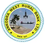
The old mark is shown at its true size. It survives only as a 187-pixel web graphic — no vector, no print artwork — which is itself a fair summary of the problem.
Water, drawn on a grid.
Four circles intersect; two angled parallels cut a tangent through the mid-section of the shape they form. The waves are then layered on an underlying grid so each one holds its relationship to the next at any size. This is what stops an organic form from going soft when someone scales it.
The system
Six colours, each given a job before it was given a swatch.
Primary
#063C89Trust#009C50Forward thinkingSecondary
#D4AF37Innovation · Wealth#00A1E0Stability#50C878GrowthAccent
#AA1F40Performance- Lexend
- display
- Book Antiqua
- secondary — headings where the bank wants to sound established
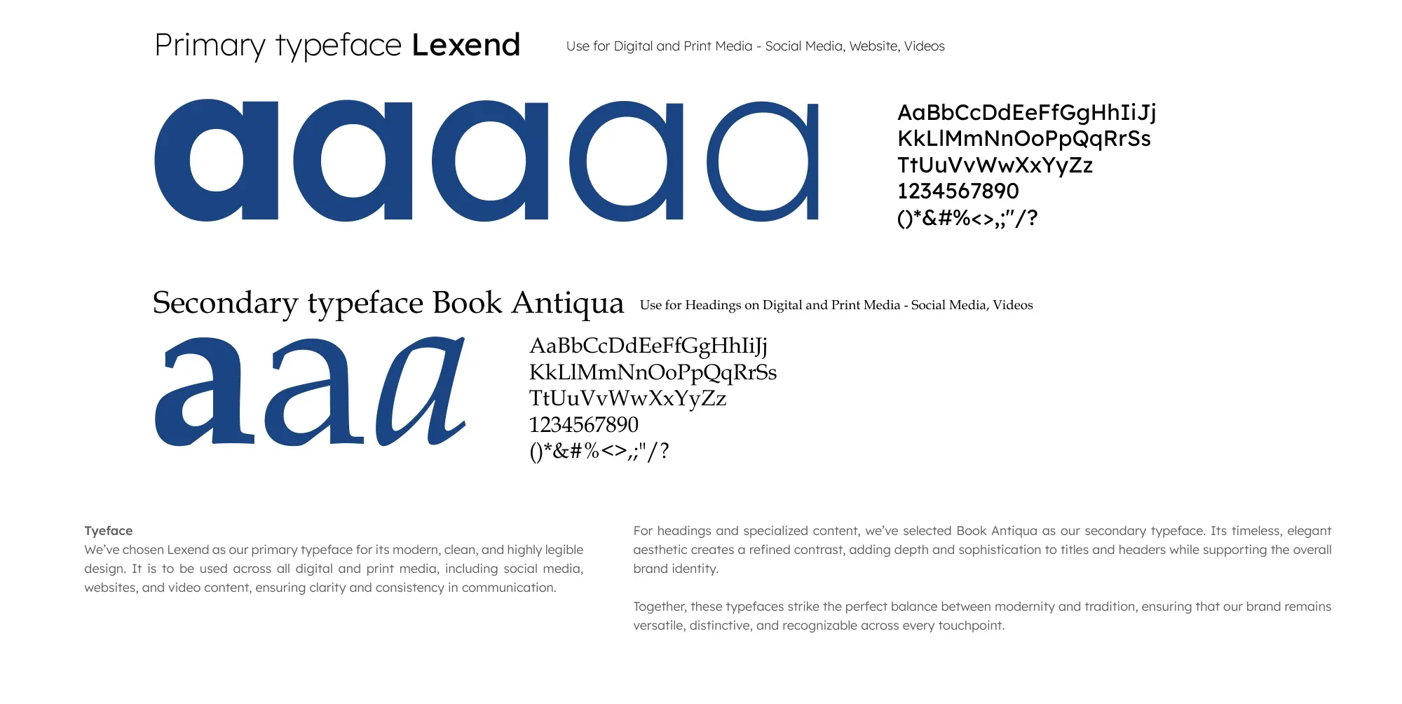
Lexend for clarity, Book Antiqua for weight.
Lexend carries every digital and print surface; Book Antiqua handles headings where the bank wants to sound established rather than new. It is a deliberate split — a rural bank has to read as modern to a young trader and as permanent to an older depositor, often on the same page.
Extended graphics
One shape, three ways to fill a surface.
The wave is not only a logo. Pulled apart, it gives the bank three reusable graphic elements — which is what lets a small marketing team produce a year of material without redrawing anything or reaching for stock.
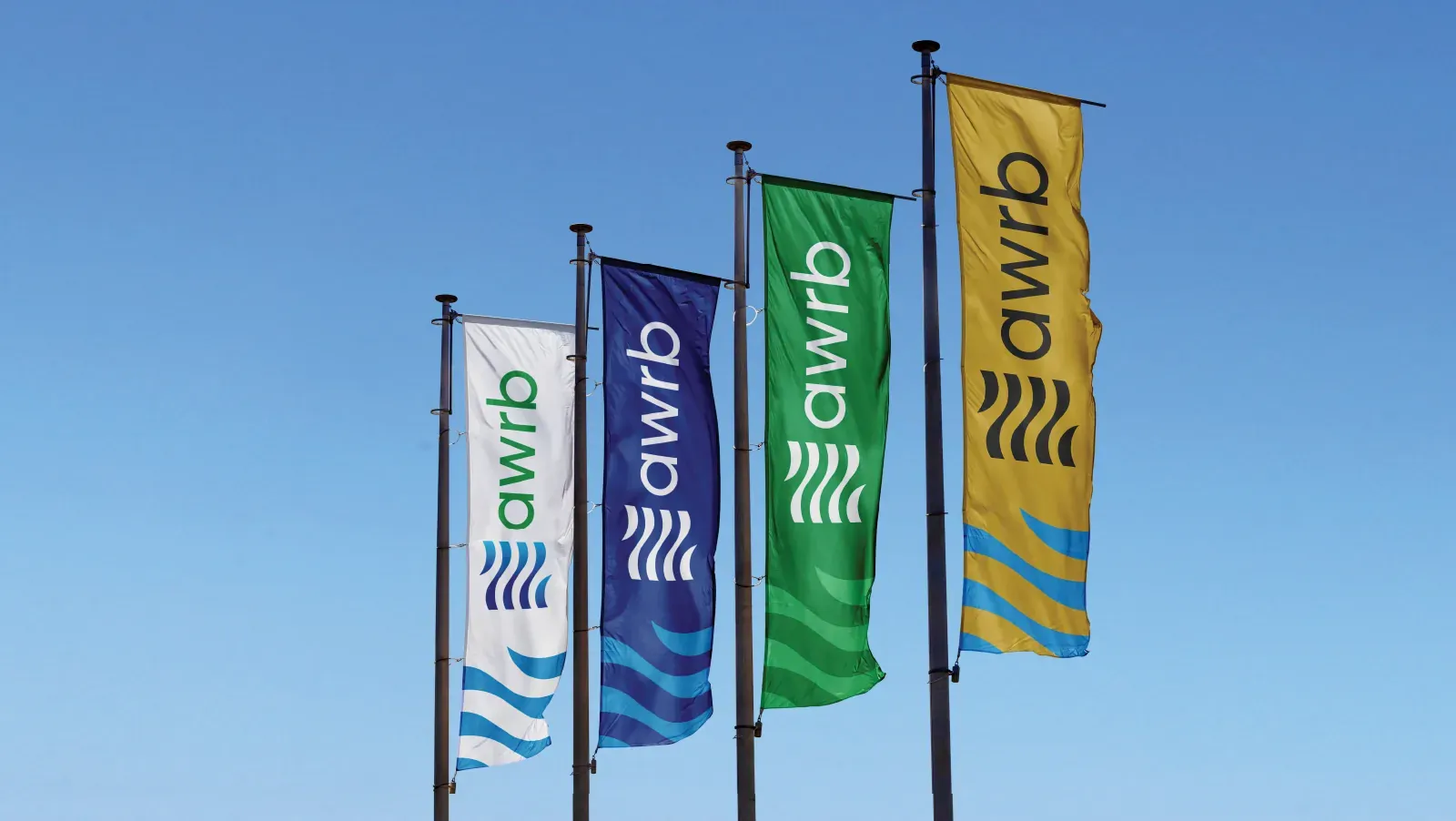
Proved outdoors and in a customer's hands.
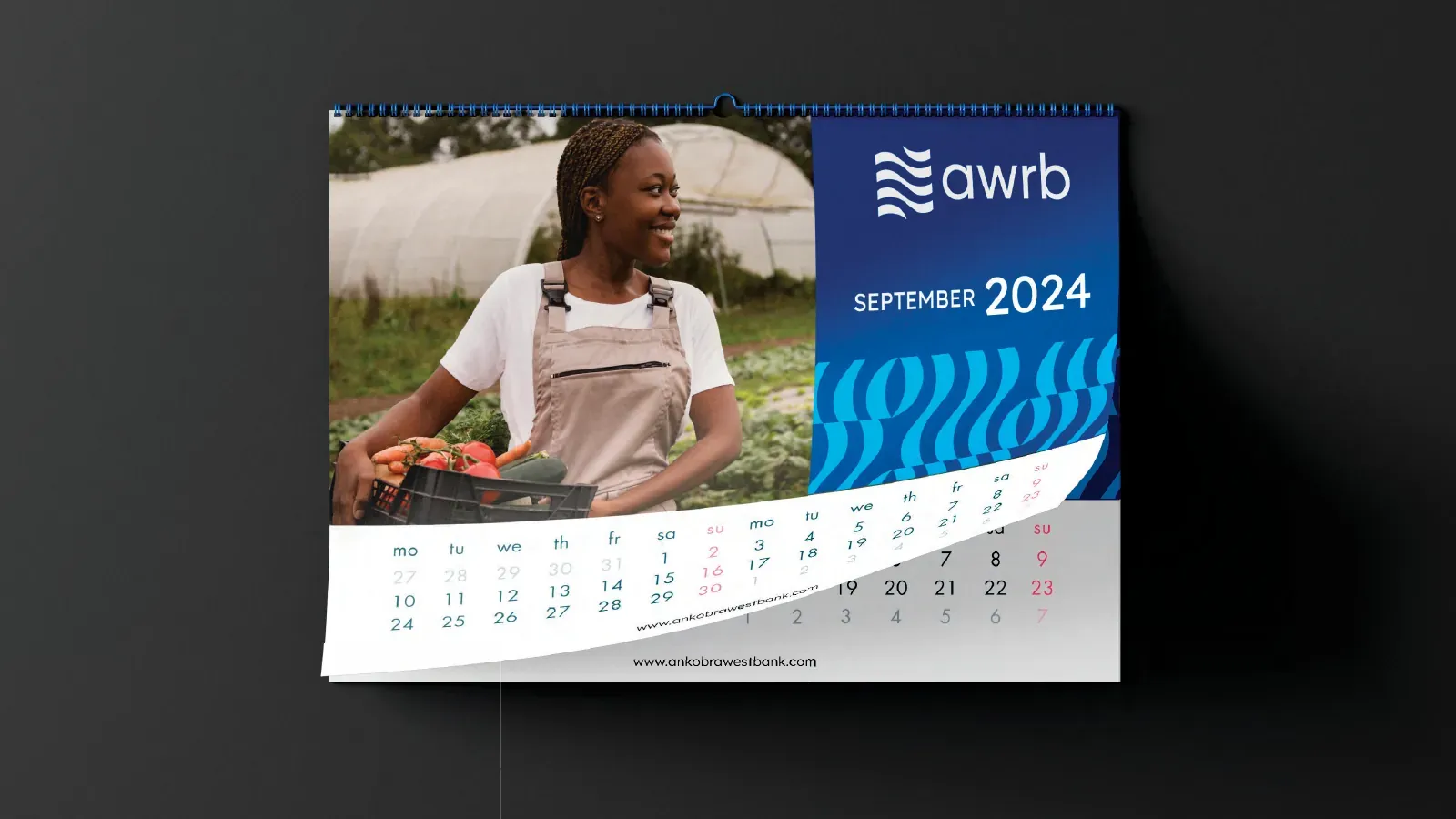
A rural bank's brand lives at the roadside and on a wall calendar that stays up for twelve months. Both were designed as brand surfaces rather than afterthoughts.
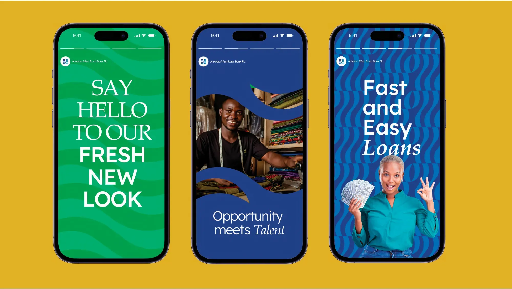
The rebrand announced itself in the customers' own language.
"Say hello to our fresh new look." "Opportunity meets talent." "Fast and easy loans." The launch ran where this bank's customers actually are — on a phone, in short vertical frames, with real people rather than stock photography.
“People recognised it as ours before they read the name.”Henry Yankson Chief Executive Officer, Ankobra West Rural Bank PLC
Applications
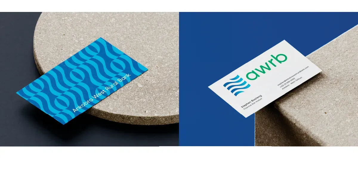
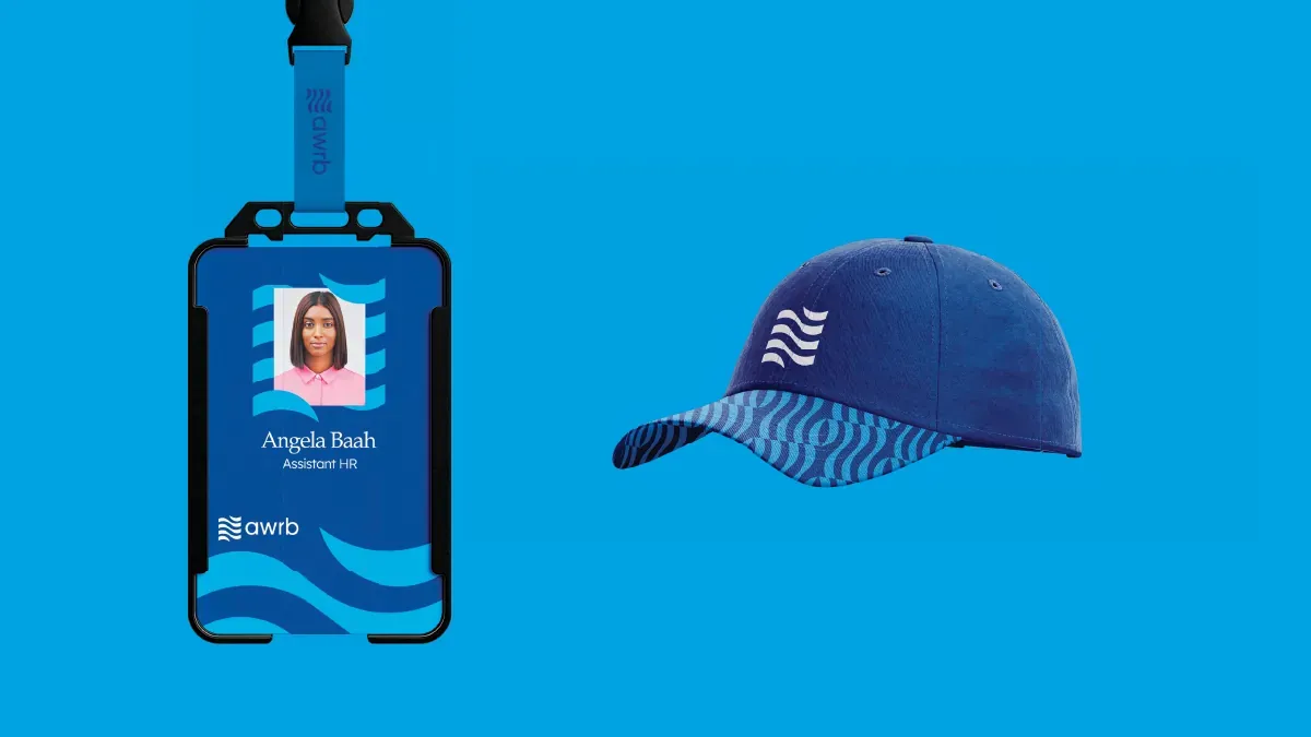
Where the system actually landed.
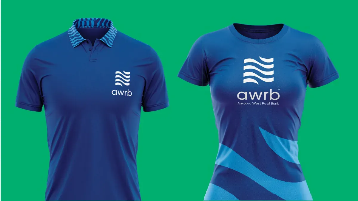
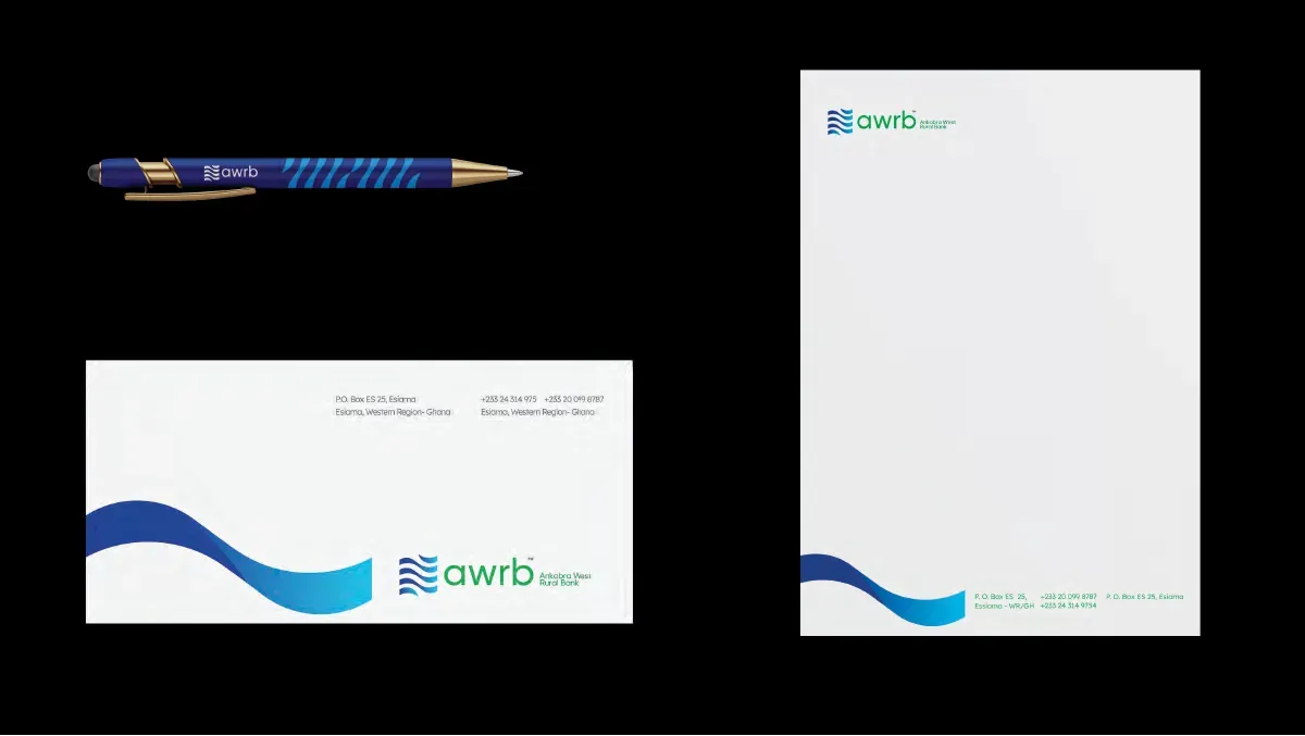
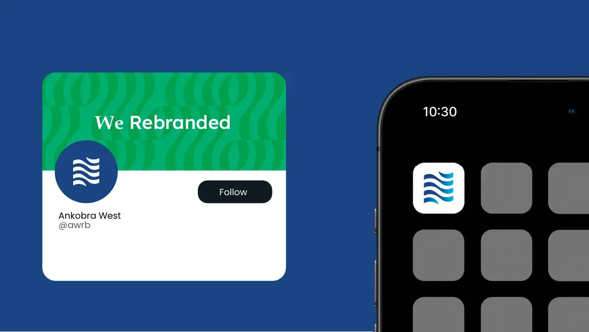
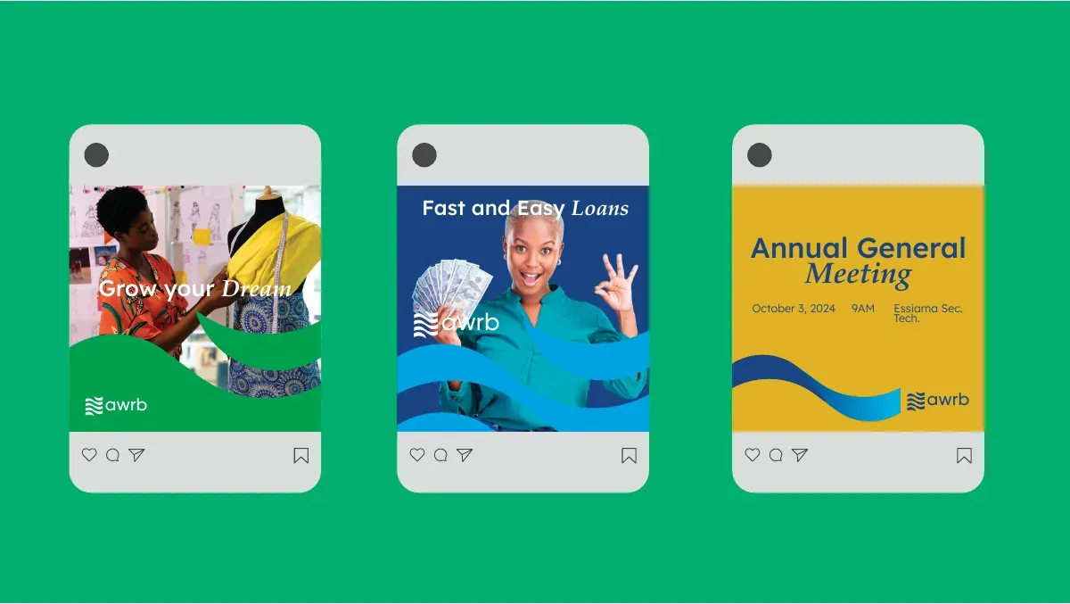
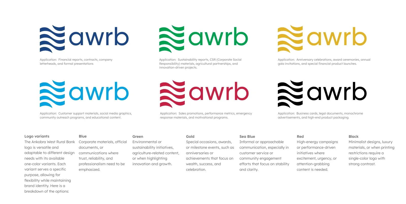
And a one-colour version, because a rural bank prints a lot of forms.
Six single-colour variants, each assigned to a document type — navy for financial reports and contracts, green for sustainability and agriculture, gold for anniversaries and awards, red for campaigns, black for legal and product packaging. The kind of rule that decides whether a brand survives its own paperwork.