A minute, if you would rather watch than read.
The problem was not that the logo was bad. It was that it had nowhere left to go.
Freight Consult has been clearing cargo through Ghana since 2006 — an accredited customs house agent with offices in Accra, Tema, Airport Cargo Village and Takoradi, affiliates in the USA, Dubai, China and the UK, and a presence at every major port and road border post in the sub-region.
In twenty years the identity had never been revisited. It was genuinely well known — customers rated it nine out of ten for recognition — but it had been drawn for a letterhead, not for an app icon, a WhatsApp avatar or a truck moving at speed. Consistency had drifted across every surface the business had added since.
So the brief was narrow and unusually hard: modernise without spending the recognition. A rebuild would have thrown away the one asset twenty years had actually bought.
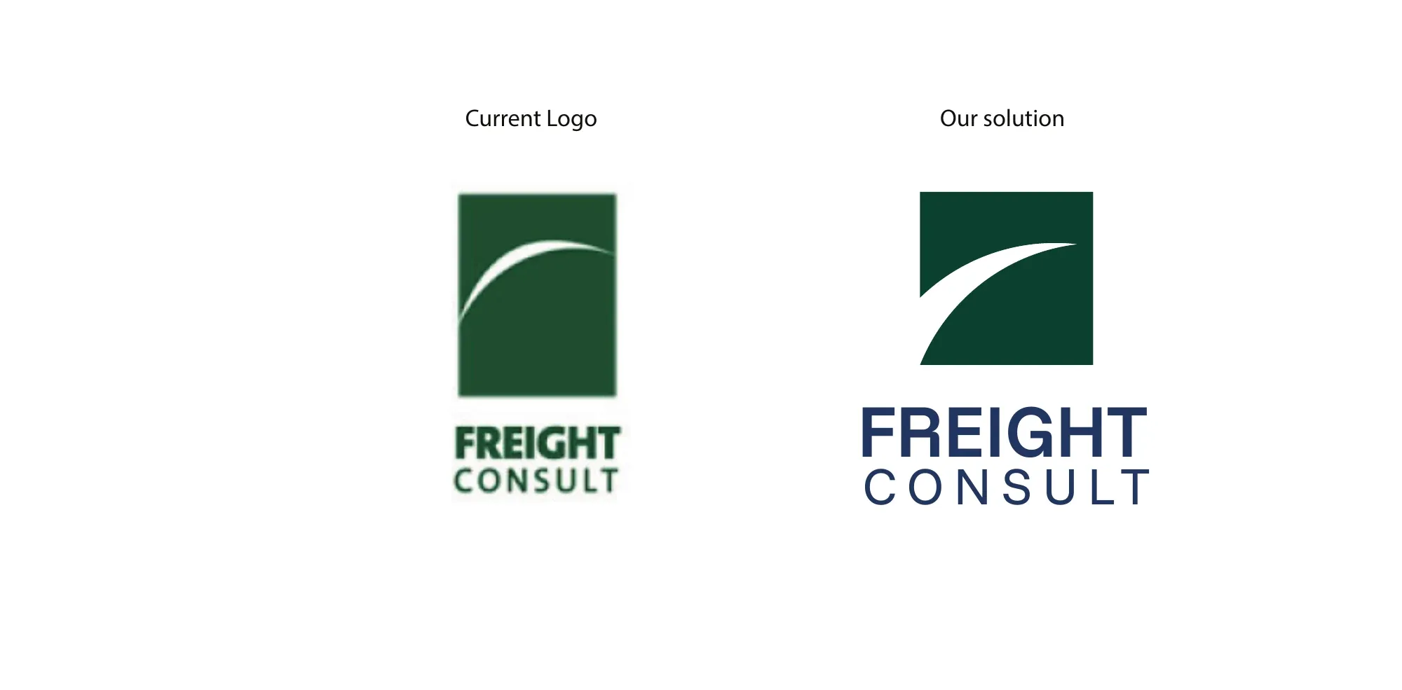
The arc was already the idea. It just wasn't doing any work.
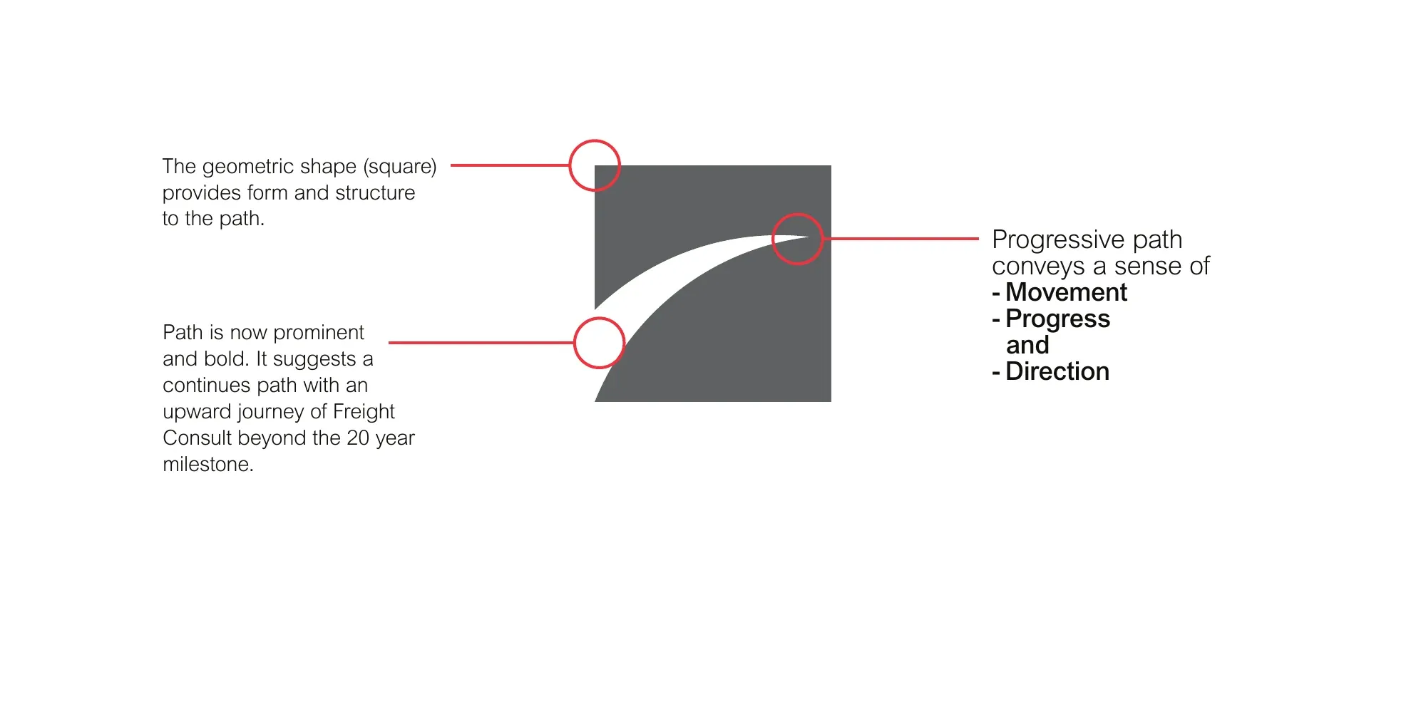
The original mark carried a thin white curve — a ship's trail, movement across water. We kept the metaphor and gave it weight: the square supplies structure, the path is redrawn bold enough to survive being reproduced at 64 pixels, and it now reads as a continuing upward journey rather than a decorative flourish.
The system
A palette that had to work on steel, cotton, paper and a phone screen.
Primary
#004634Reliability · Stability · Resilience#003366Authority · Professionalism · TrustSecondary
#56F09FInnovation · Freshness#004F9EStrength · Depth#6495EDClarity · CommunicationNeutral
#F5F5DCSimplicity · Honesty · ApproachabilityAccent
#FA3523Energy · Passion#FA8E00Optimism · Energy#008080Modernity · Balance- Space Grotesk
- display — headings, print and digital
- Manrope
- body — body copy — open-licensed, so the client's own team can set the brand correctly
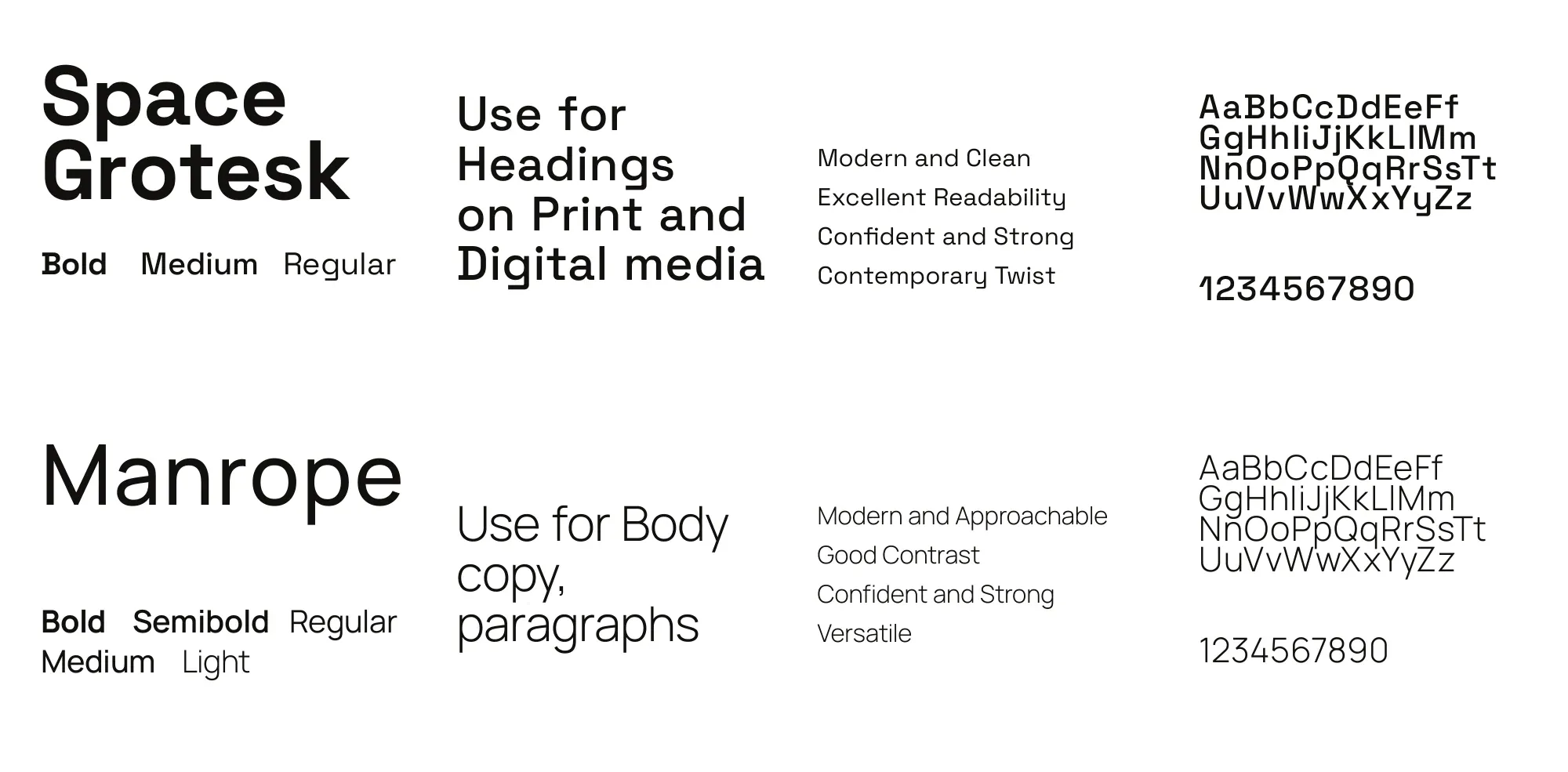
Two typefaces anyone at the company can actually use.
Space Grotesk for headings, Manrope for body. Both are open-licensed, so a clerk setting a quotation or a customs form gets the real brand without anyone buying a seat — the kind of unglamorous decision that determines whether an identity survives its first year.
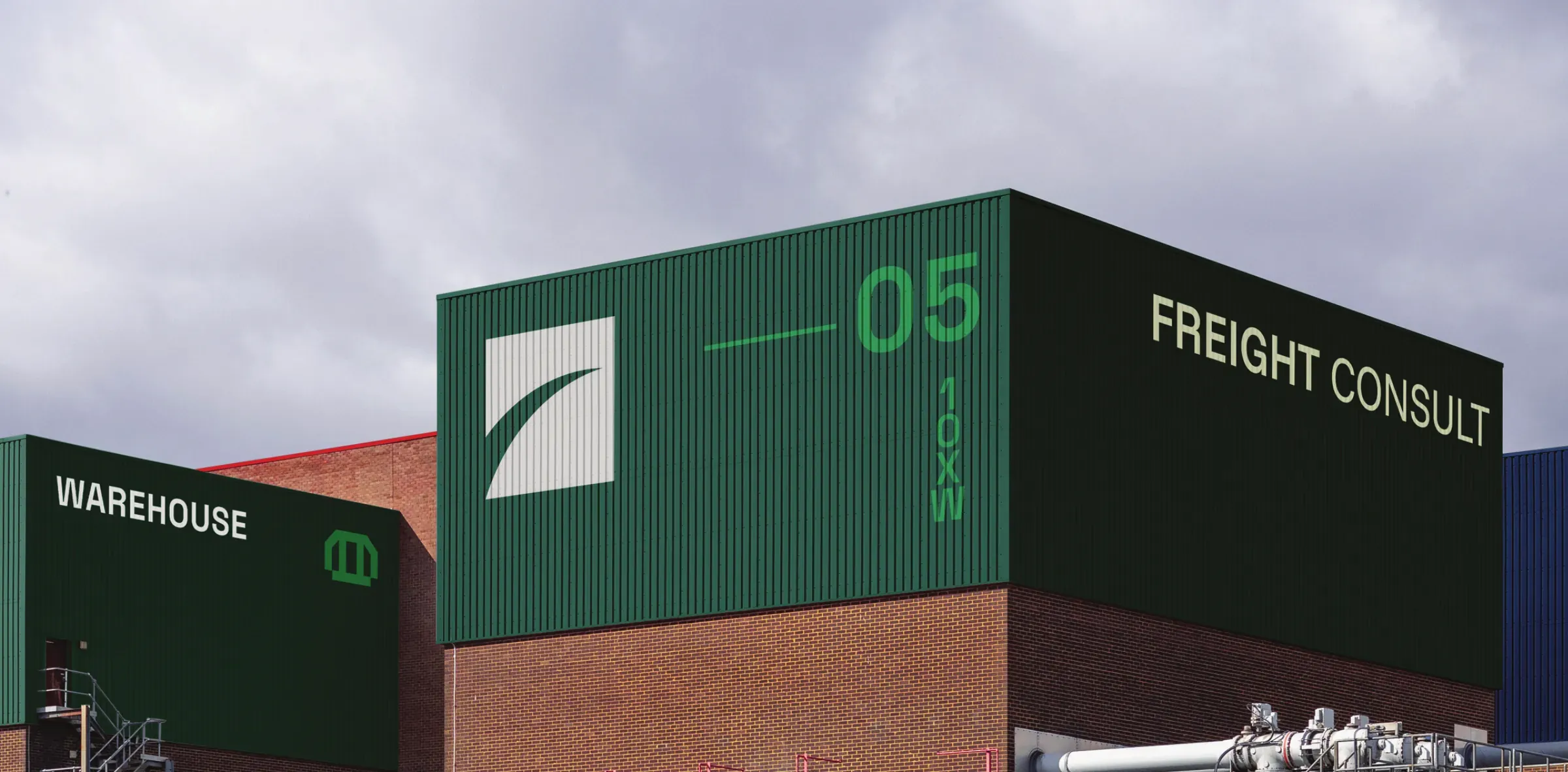
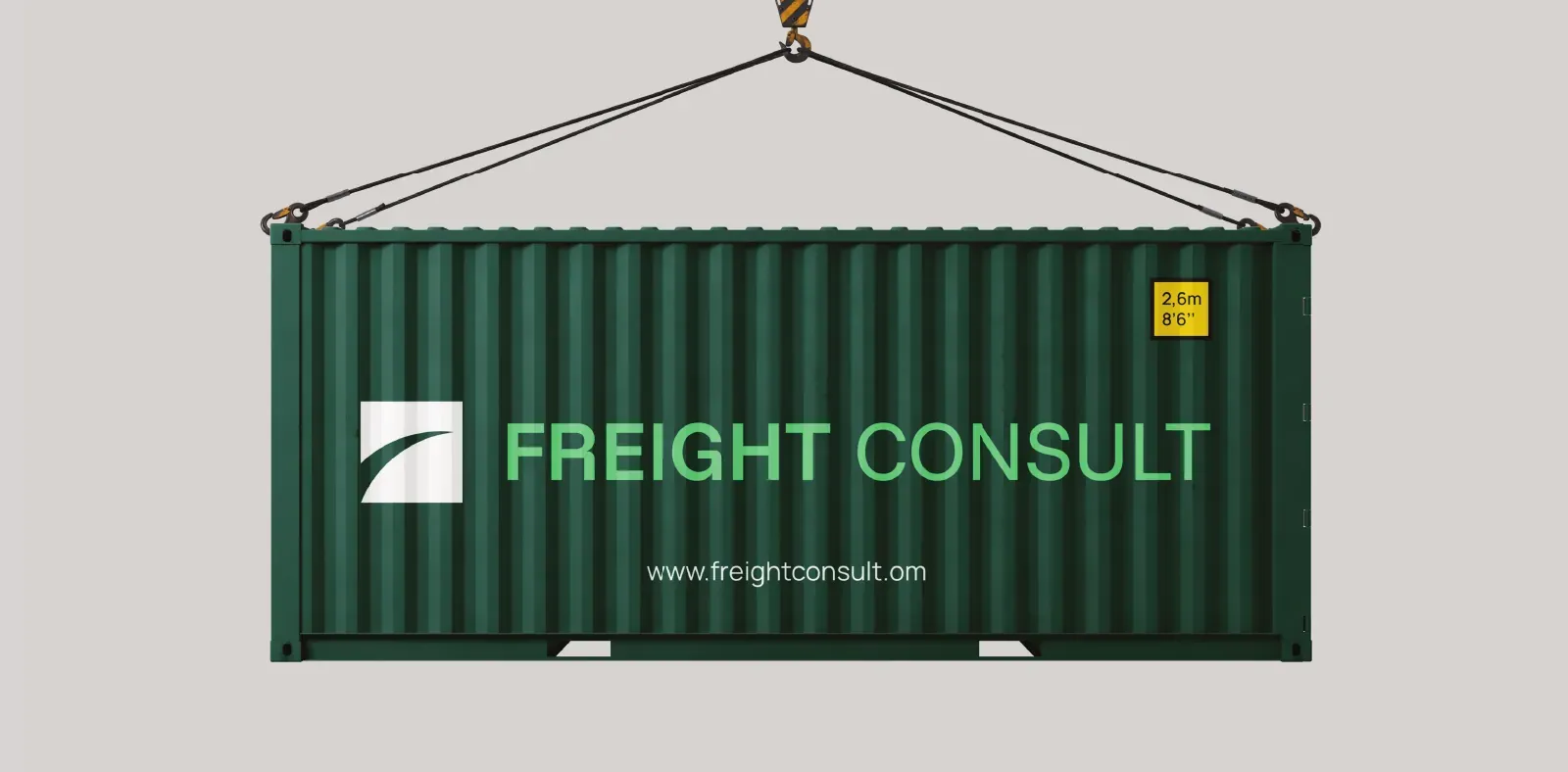
Proved on the surfaces the business actually owns.
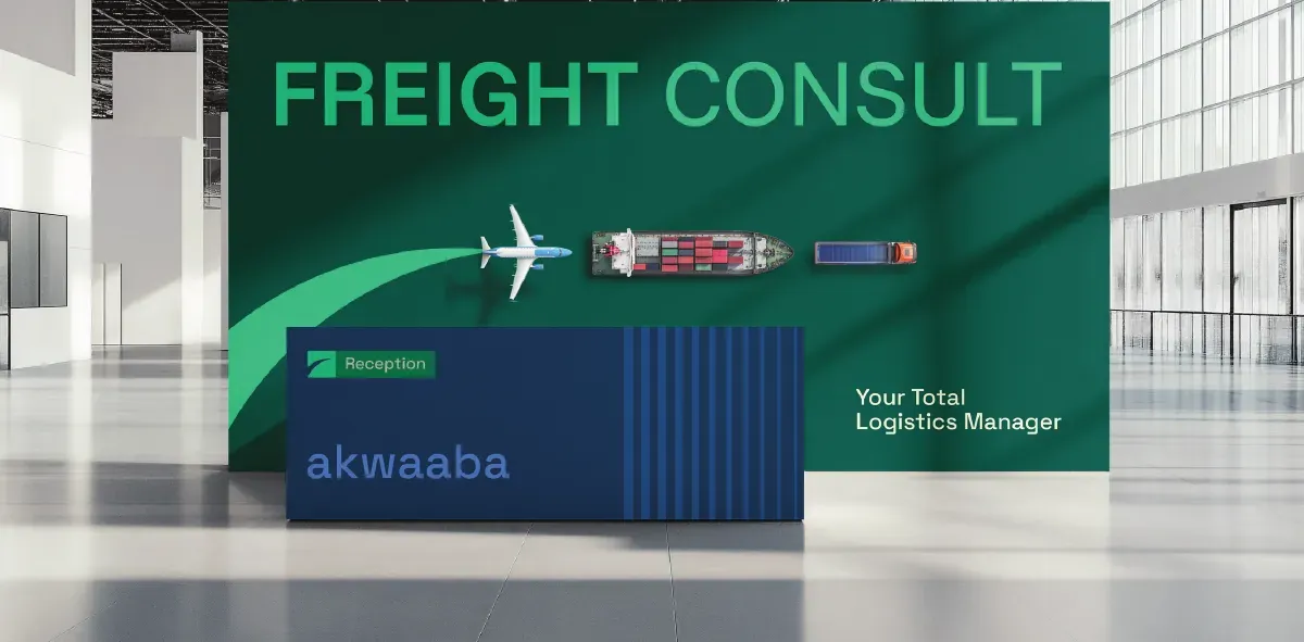
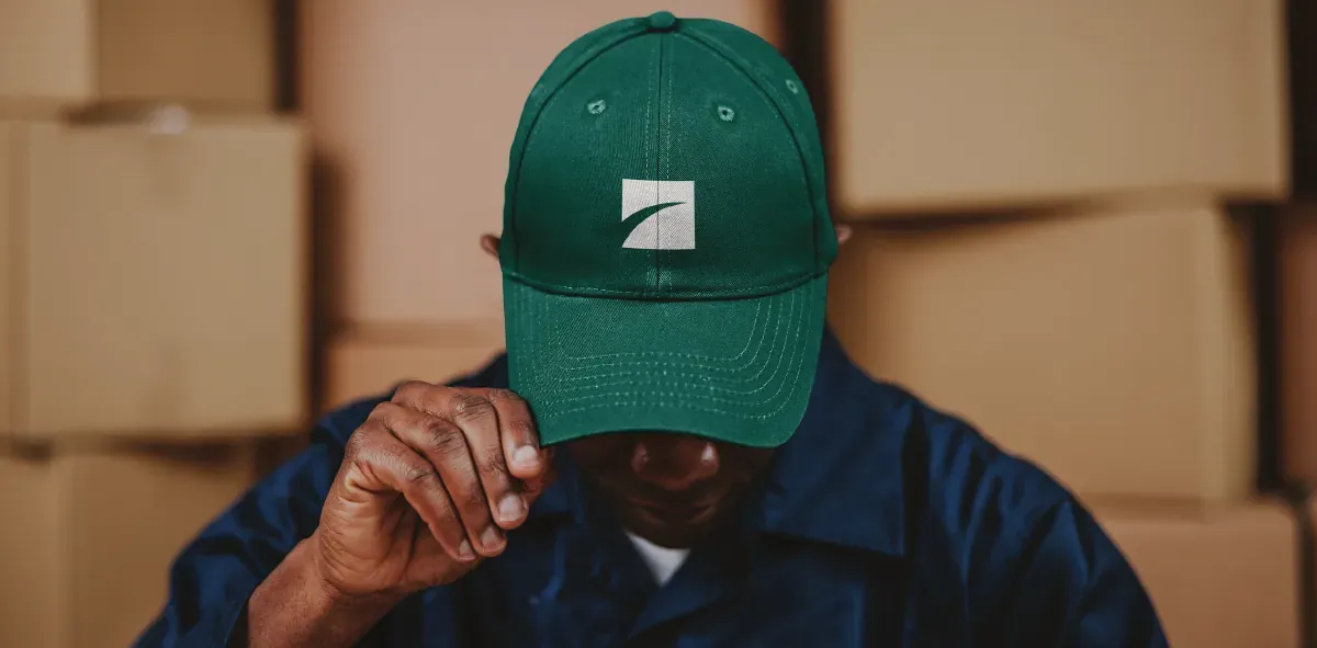
Freight moves. The identity had to hold together across a container being craned onto a ship, a truck on the N1, and a hard hat in a warehouse — none of which forgive a mark that only works on white.
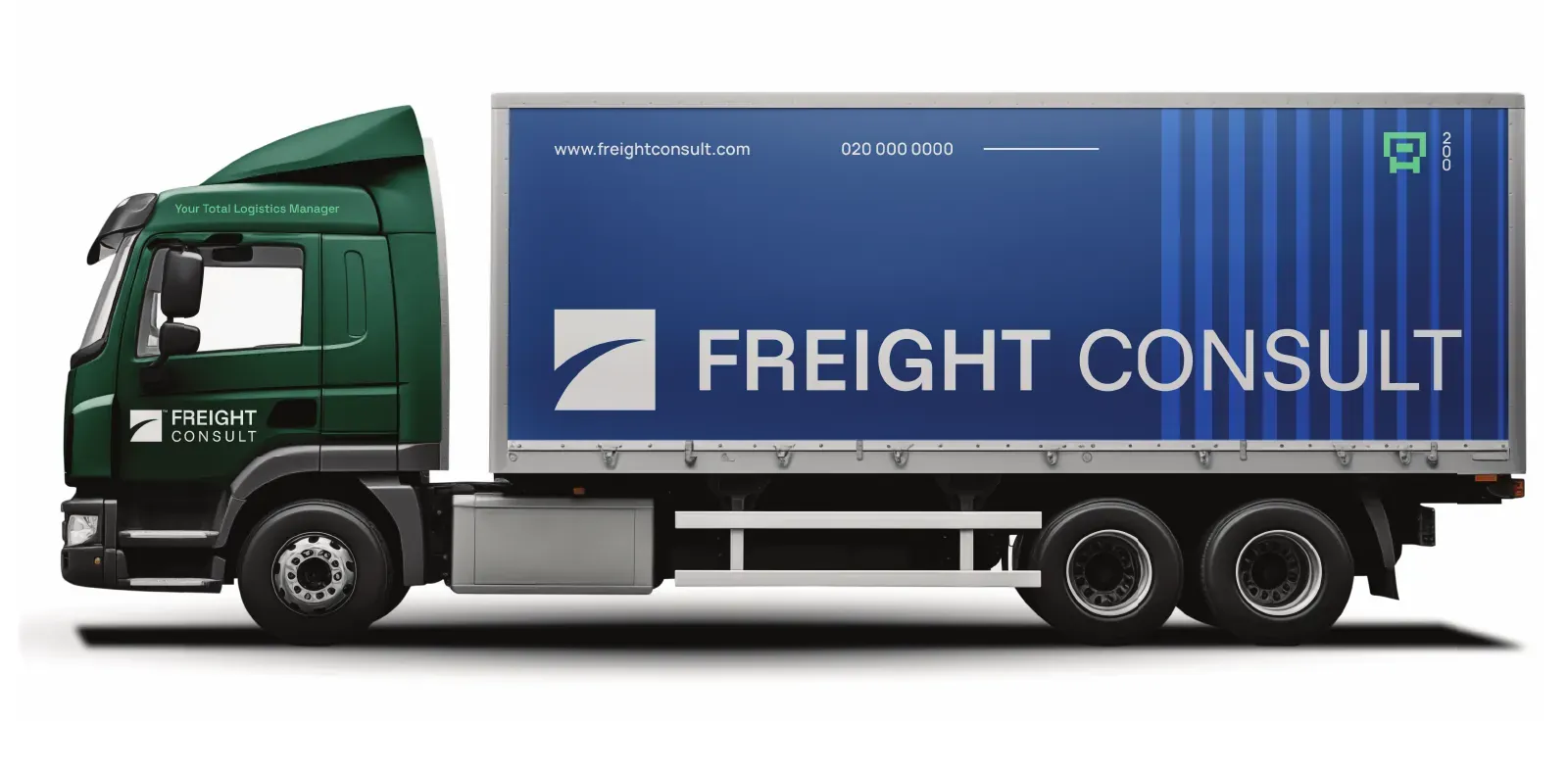
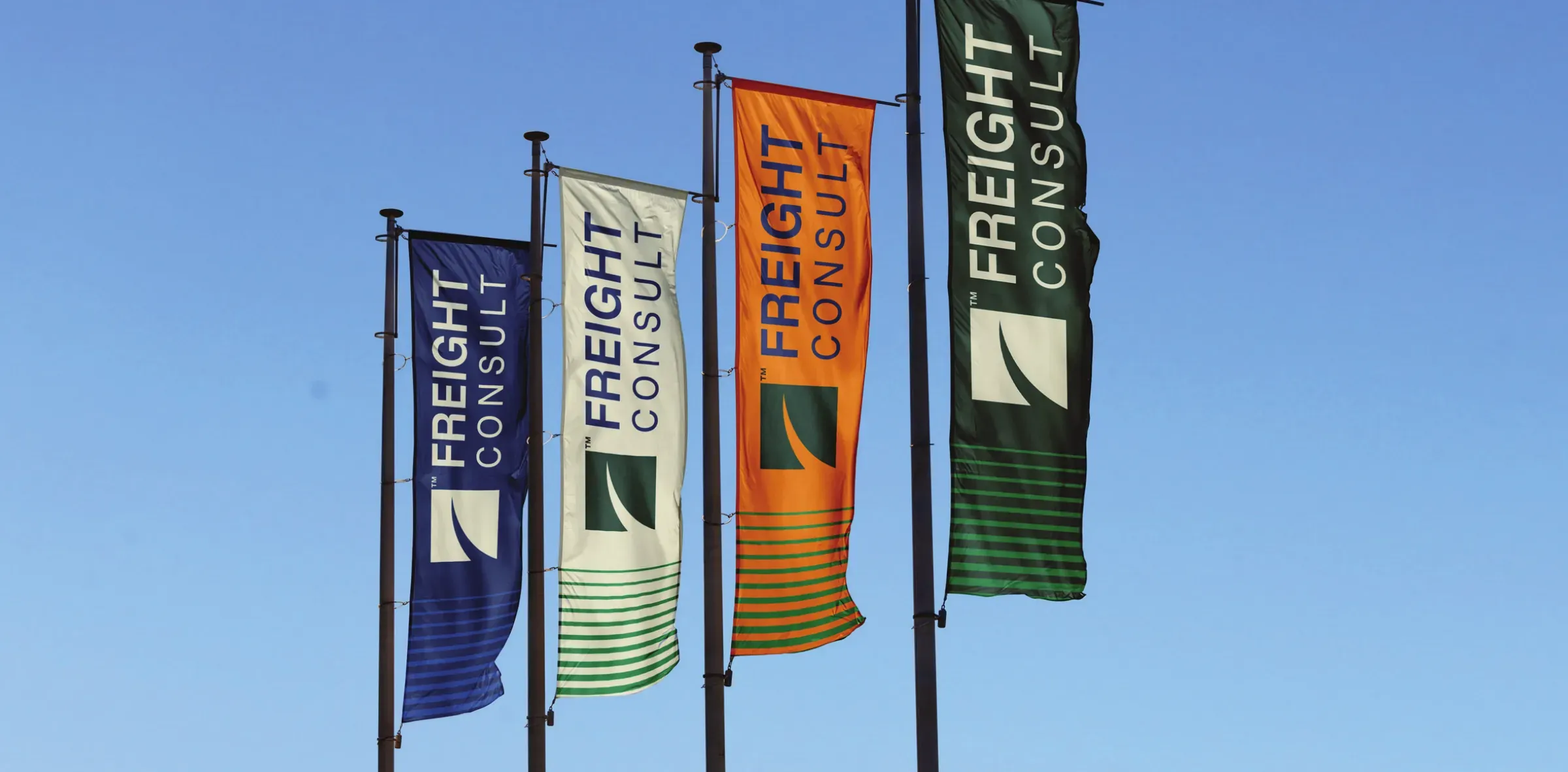
The palette is wide on purpose.
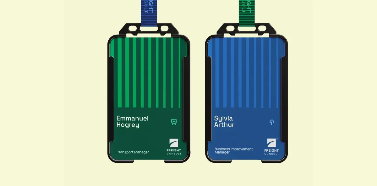
A logistics business signs, labels and codes constantly — aisles, cargo classes, departments, document types. A two-colour system runs out of distinctions fast.
“Our customers still recognise us instantly. Everything else about how we look has changed.”Sylvia Arthur Business Manager, Freight Consult Ghana Limited
Applications
What a system looks like once it leaves the deck.
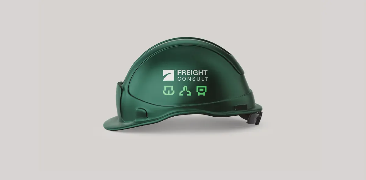
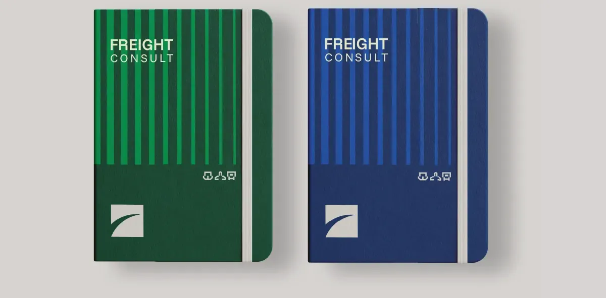
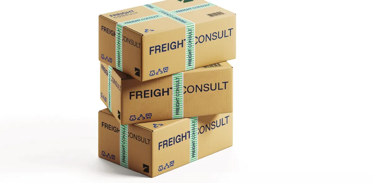
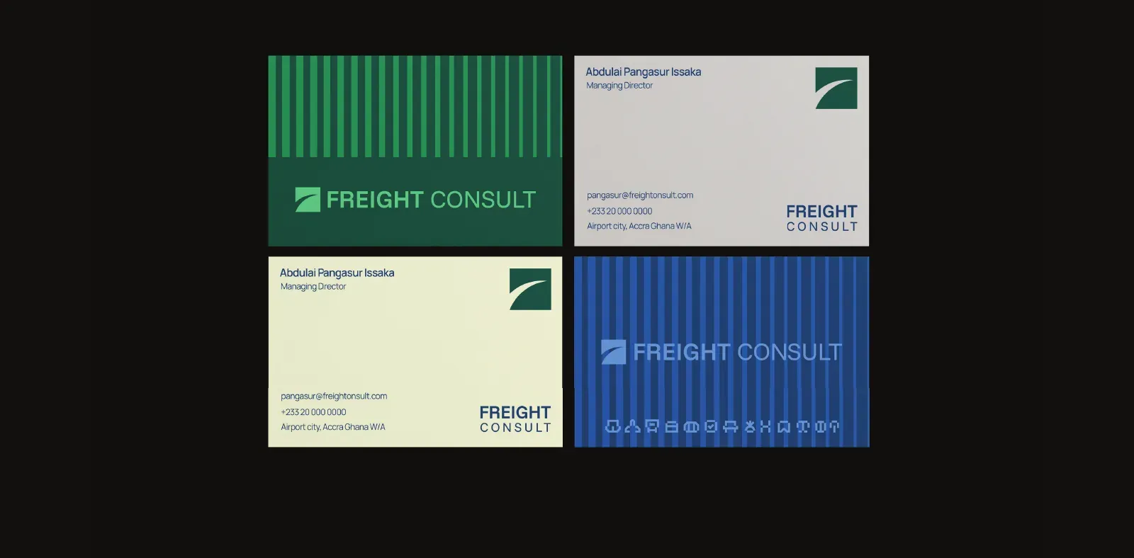
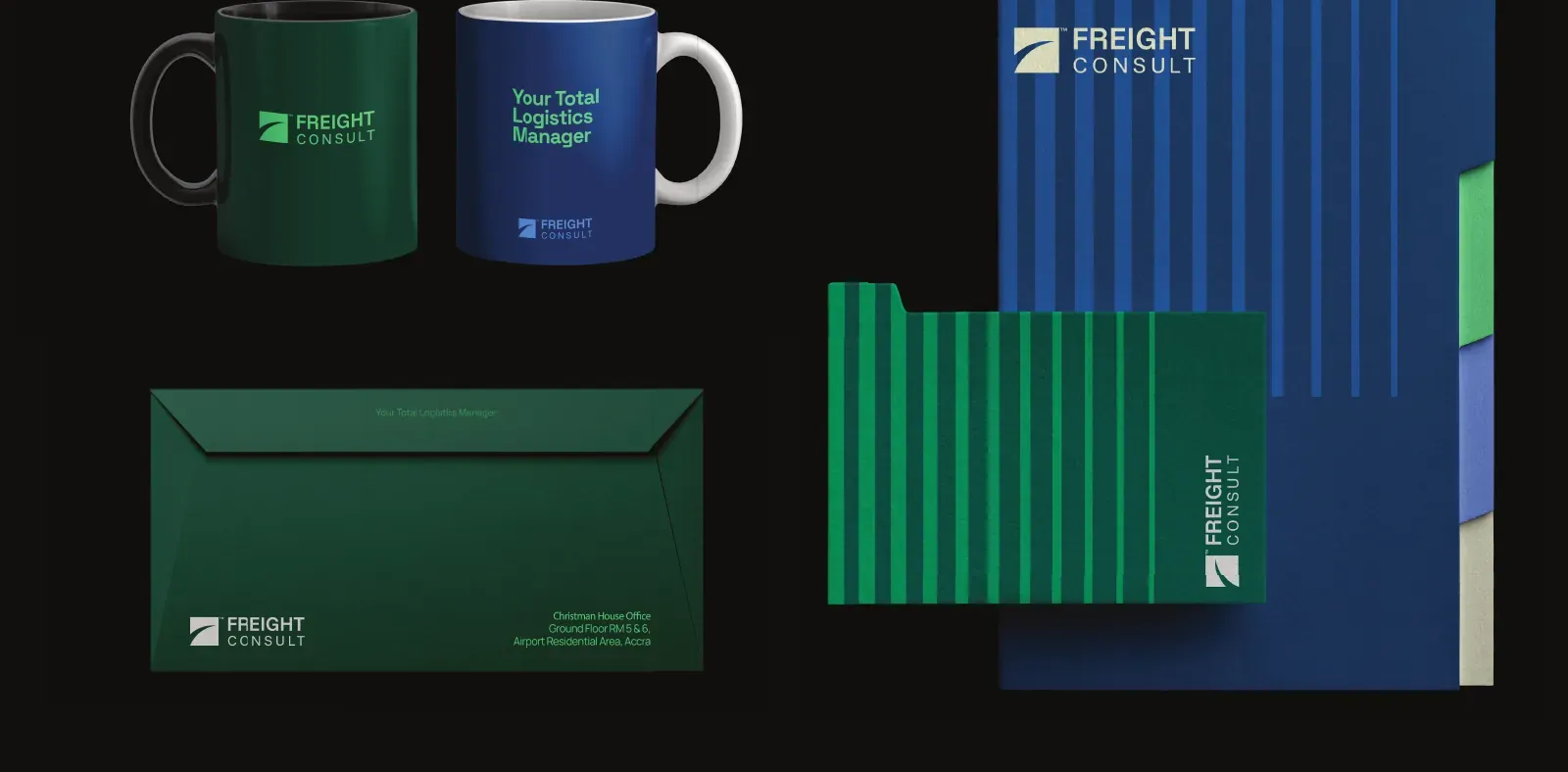
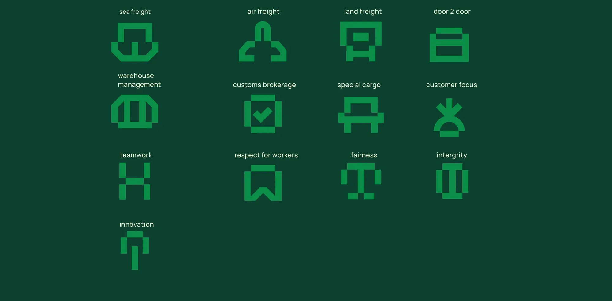
Thirteen icons, drawn on the mark's own grid.
One for each service and one for each stated value, so the brand can label a warehouse aisle or a values poster without reaching outside itself for a stock icon that does not match.