A Ministry brand that teenagers would actually watch.
The Ministry of Education, through its agency CENDLOS, was launching a television channel to teach young Ghanaians — running on traditional broadcast and online at the same time. It needed an identity from nothing: no channel, no audience, no equity to build on.
The difficulty was not drawing a logo. It was that the brief contained two audiences pulling in opposite directions. A government education channel has to satisfy a Ministry, which expects the visual language of an institution. It also has to survive being scrolled past by a fifteen-year-old, who has an entire internet of alternatives one thumb-flick away. Most brands in this position pick one and lose the other — usually by looking official, and therefore looking like homework.
So we refused the compromise and built the contradiction into the system instead. Channel MOE carries two palettes: a corporate set for the Ministry's documents and formal communications, and a TV set — hotter, pinker, more saturated — for on-screen graphics and social. Same logo, same type, same rules. Different room, different voice.
An open book, in a country's colours.
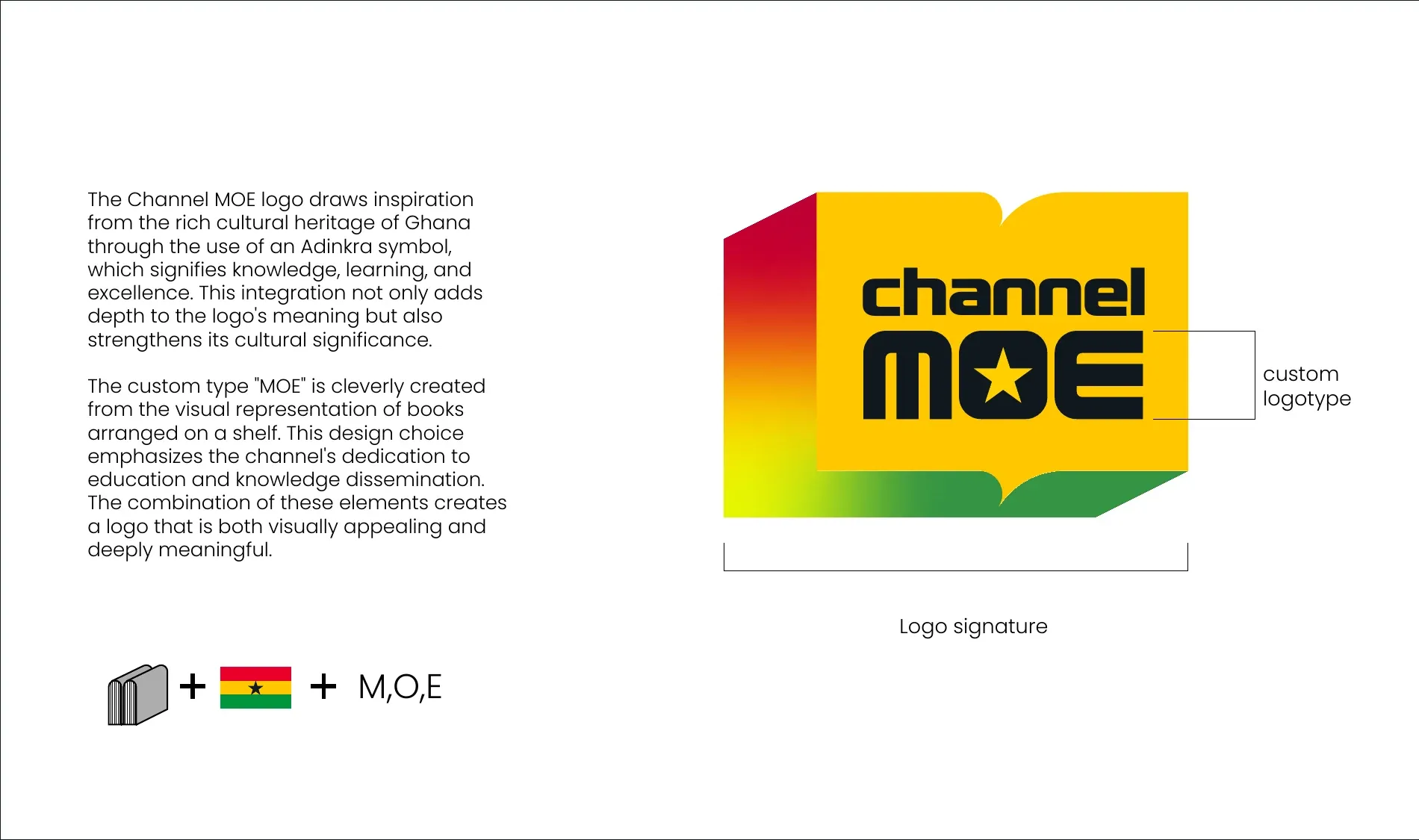
The mark is a book seen open — knowledge, and "a portal to the minds of the author", which is how the guidelines put it. It is drawn in Ghana's national colours with an Adinkra reference and the flag's black star set into the O of MOE, so the channel reads as national without ever printing the word.
The logotype is custom, built from the shapes of books standing on a shelf. That detail matters more than it sounds: it means the wordmark and the symbol come from the same idea rather than being a drawing with a typeface parked next to it.
The system
Yellow does half the work. That is written down.
Primary
#F6C500Pantone 7548 C#005DB4Pantone 300 C#191E25Pantone Black 6 C#359444Pantone 355 C#C8002DPantone 185 CSecondary
#2F79C3#00FBADNeutral
#F0DFA6Accent
#E15200#D3456BNot a suggestion — a proportion, specified. Guidelines that only list colours get ignored; guidelines that say how much of each to use survive contact with whoever inherits them.
- Akira
- display — uppercase only — wide, flat and loud
- Poppins
- body — web, social and print
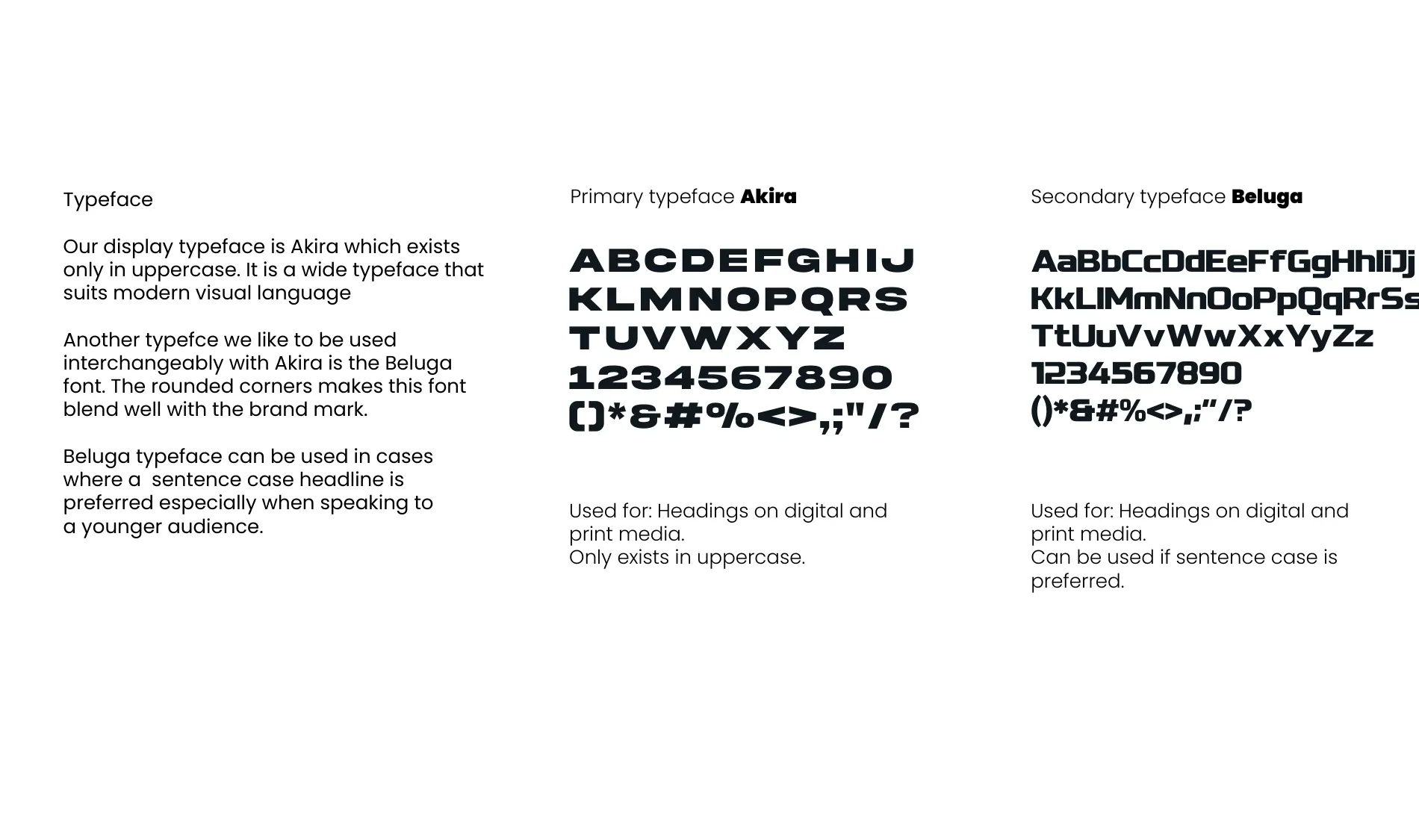
Akira for volume, Poppins for everything else.
Akira exists only in uppercase and is wide, flat and loud — right for a title card, wrong for a paragraph. Poppins carries body copy across web, social and print. The split lets the brand shout and explain without changing its voice.
One brand, two registers.
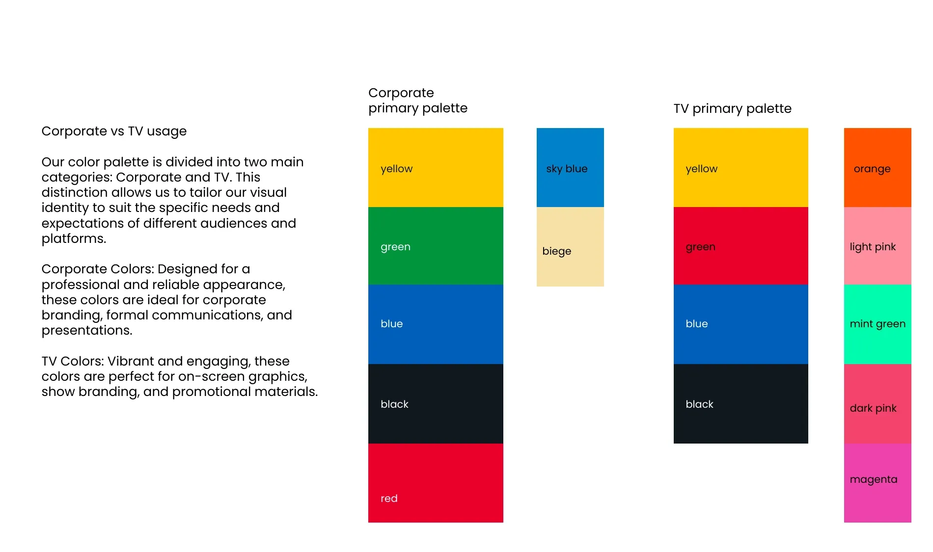
Corporate on the left: yellow, green, blue, black, red, plus sky blue and beige. Broadcast on the right: the same yellow, blue and black, but red promoted, green demoted, and orange, mint, pinks and magenta added. A Ministry press release and a Friday-night promo can both be correct.
Extended graphics
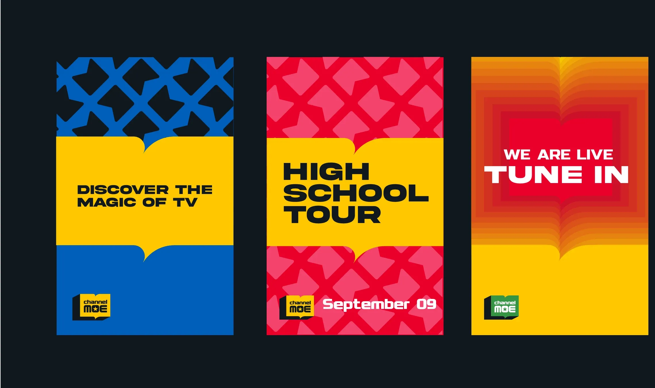
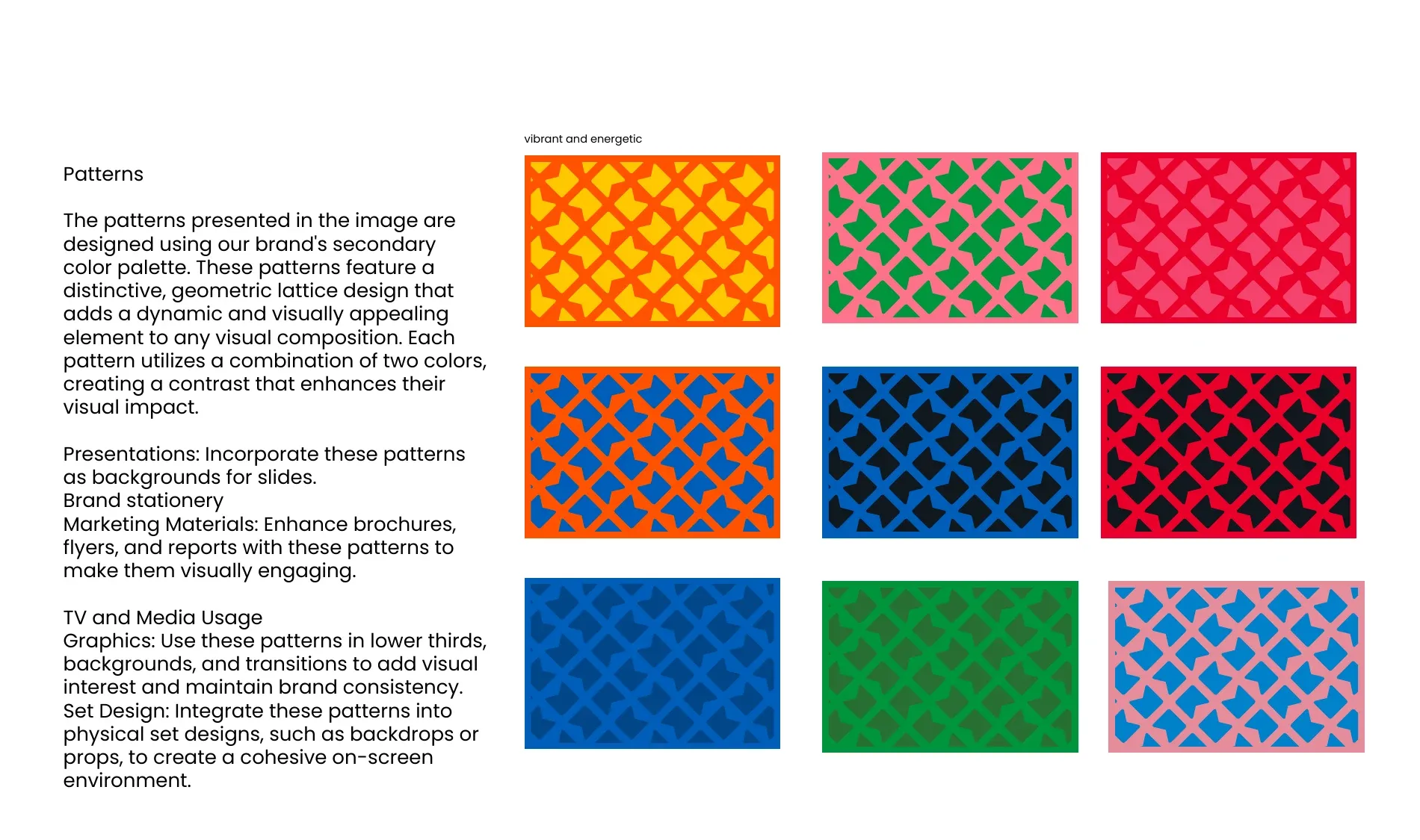
A lattice that can be any two colours in the system.
The pattern is built from the mark's own geometry and specified in nine colourways, each a pairing already cleared for contrast. A producer choosing a background for a lower third is picking from combinations that were checked, not guessing.
The part most identities never get asked to do.
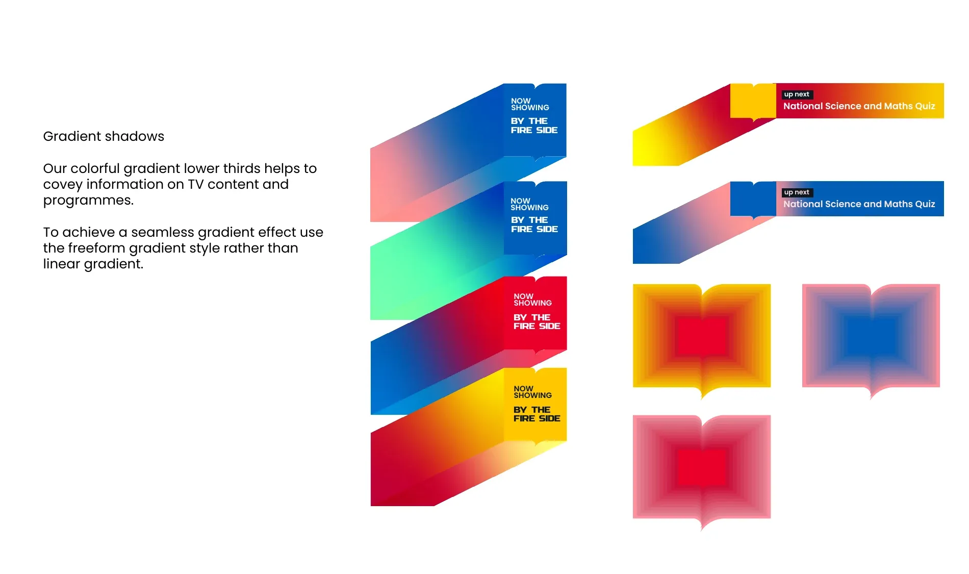
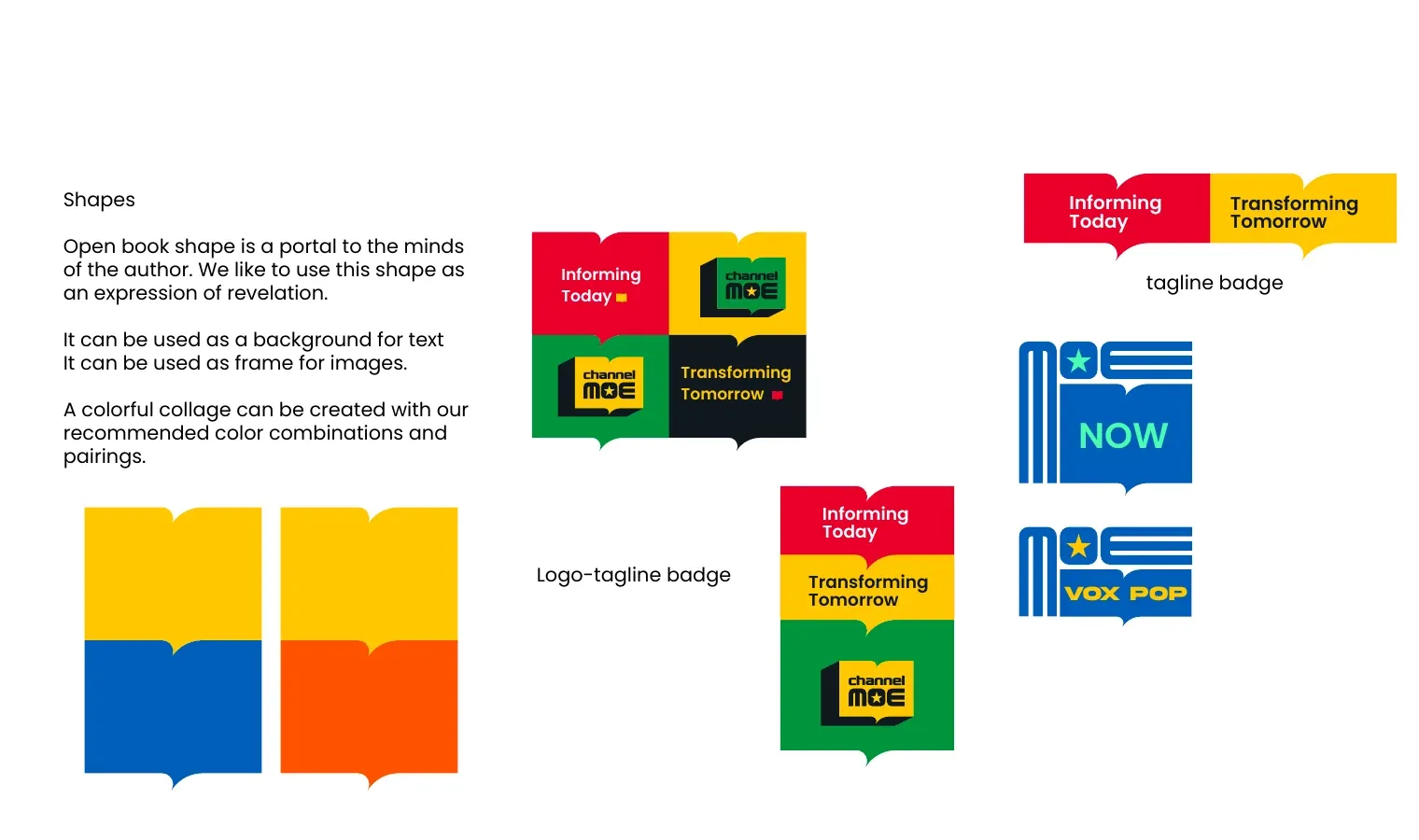
A channel lives or dies on furniture: the strap that names the programme, the card that says what is on next. These use the open-book shape as a frame and a gradient drawn from the primaries, so the brand is doing the informing rather than sitting in the corner while something else does.
Sixteen ways to be the same channel.
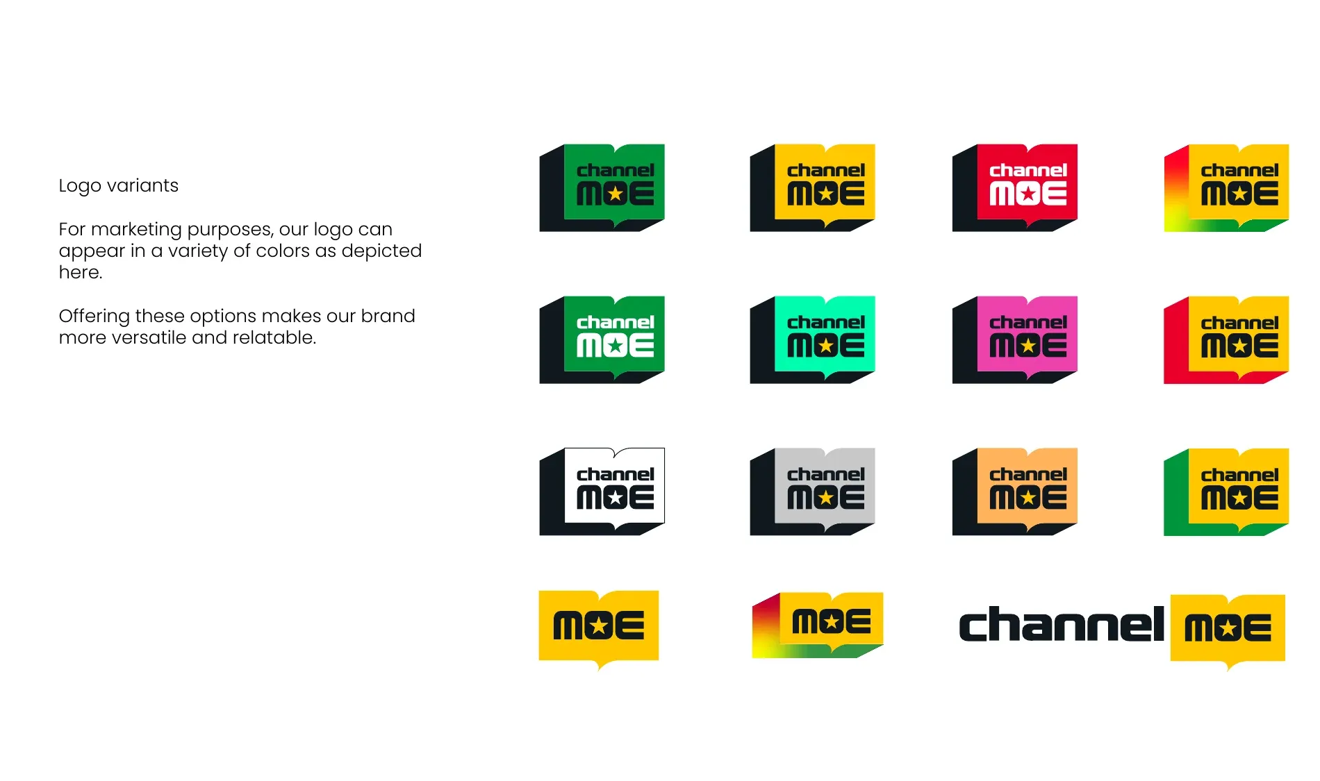
The mark is specified in sixteen colourways and the open-book shape doubles as a frame for text and images. Between them, a small team can produce a season of material that varies constantly and never stops being Channel MOE.
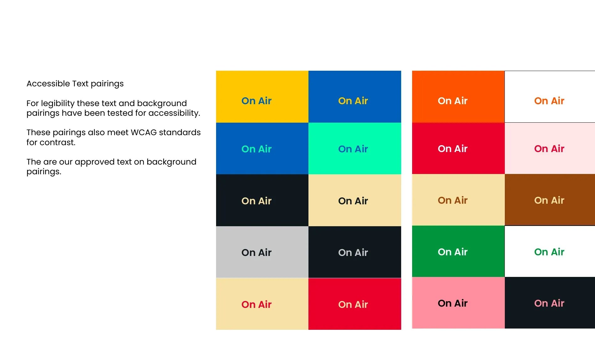
Every colour pairing was tested, not eyeballed.
Twenty text-and-background combinations, checked against WCAG contrast standards and published in the guidelines as the approved set. On a channel whose whole purpose is that people read what is on screen, a palette nobody checked is a palette that fails the brief quietly.
Applications
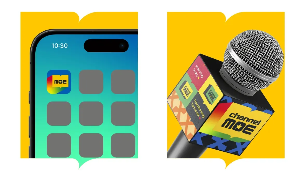
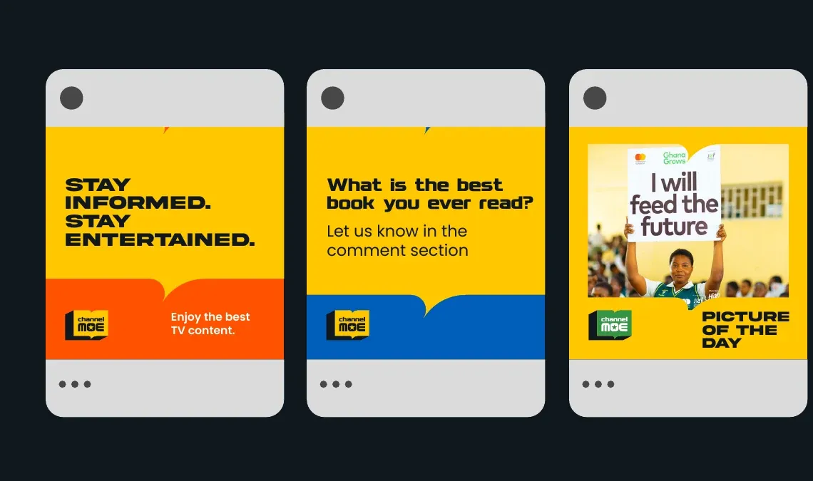
On air, on the street, and on a phone.
Gradients, named for what they are meant to feel like.
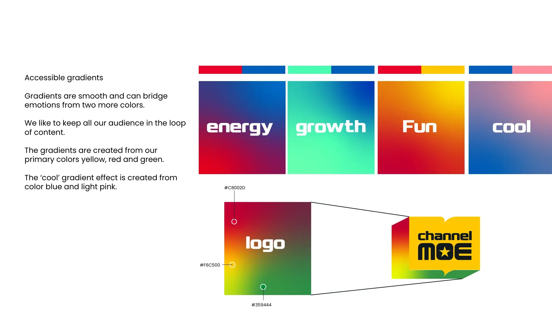
Energy, growth, fun, cool — four gradients built from the primaries, each labelled with the emotion it carries. It is a small thing that makes a guideline usable by someone who is not a designer, which is most of the people who will use it.